


Financial Dashboard for Kantar
Interaction Design
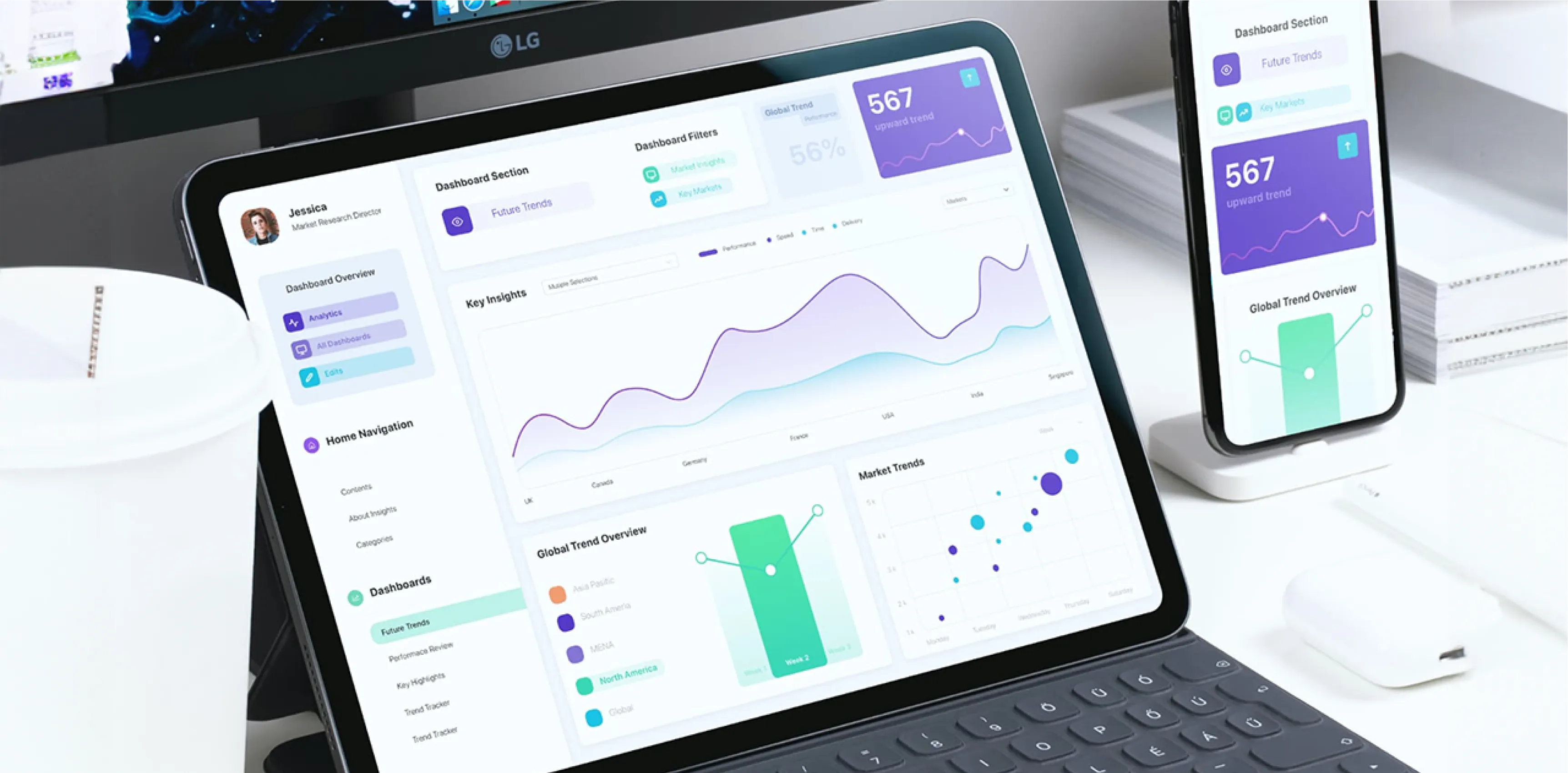
Nano Insights: A Data Driven Dashboard for displaying key global financial data
Nano insights (Client name is an alias for confidentiality) is one of the largest marketing and insights company, with the majority of its product, focused on customer data surveys from top companies. For this project, they approached us with a unique problem and a proposition.
They had extremely detailed data and they presented all of their findings which are very detailed in PowerPoint which made things really cumbersome, plus the fact that it was not on the cloud and the data visualizations were not interactive seriously inhibited the decision making of the top execs of their client, one of the largest banks in the world. The data gathered over 10M+ data points under the various sectors in more than 30 odd countries that determine the future trends and provide valuable insight to its customers who use these to make important business decisions
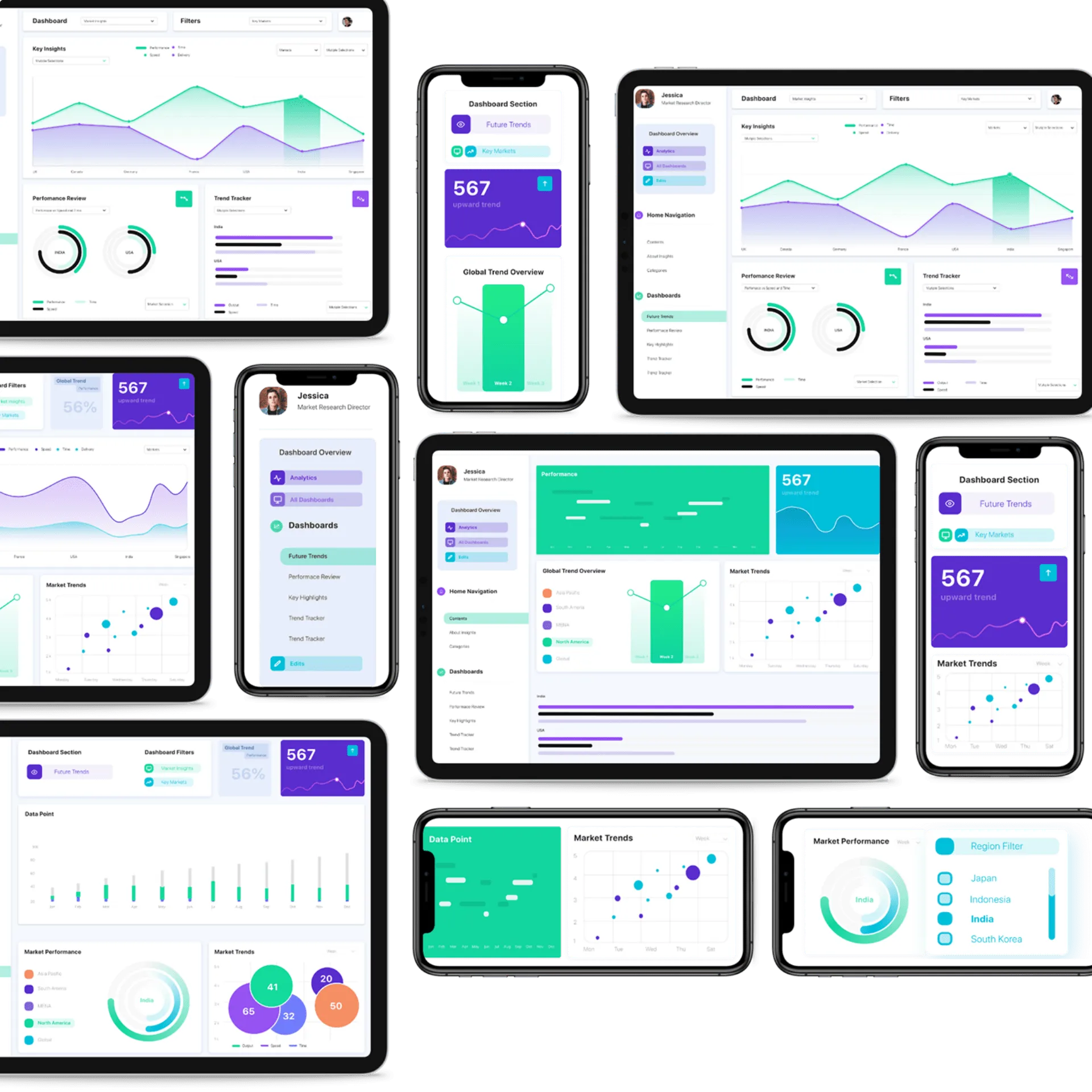
Data Visualisation is Key
The key would be to make sure if there was a bar graph or a pie chart, they were represented in the right way and showcased relevant data that made sense. Read below on why there were chosen.
Data Visualisation was key to making sure the user experience that we (Client + Analogy) sought was represented in the right way. At the same time, we had to be cognizant of the fact that we had to develop, test, and also make sure there were no bugs in the overall application. We also had to keep in mind behavioral traits on the user side to make sure that they were not being presented with something that was radically new and different which made their job harder. It had to have the right amount of innovation in terms of UX, navigation, and UI and so we set out to figure out the basics of graphs and the kinds that should go into a dashboard. There were multiple prototypes and visual options built in the form of graphs and some of them are outlined below with all the information and data changed so as to maintain client data confidentiality.
Crafting for Perfection
Each data visualization type and chart had to be mapped out so that this could be then translated as a working model in Power Bi. The team collaboratively working with the client’s data processing department as well as the power bi developer to better understand the complexities, calculations, and various data types that would be to arrive at the final data points.
At this point, we decided to try out two different approaches, a data calculation approach where power-bi would calculate the raw data and generate visualizations and a compiled data set that was light and faster to run. Each of them came with its own set of challenges the compiled data approached required multiple ‘“hacks” and tricks to apply certain data filters white the other approach was too data-intensive and had to be heavily optimized to avoid an application crash. and We hired two separate power-bi development firms to build these relation models. Since the project was a very high stake and we were running very short on time we ran these two approaches parallel.
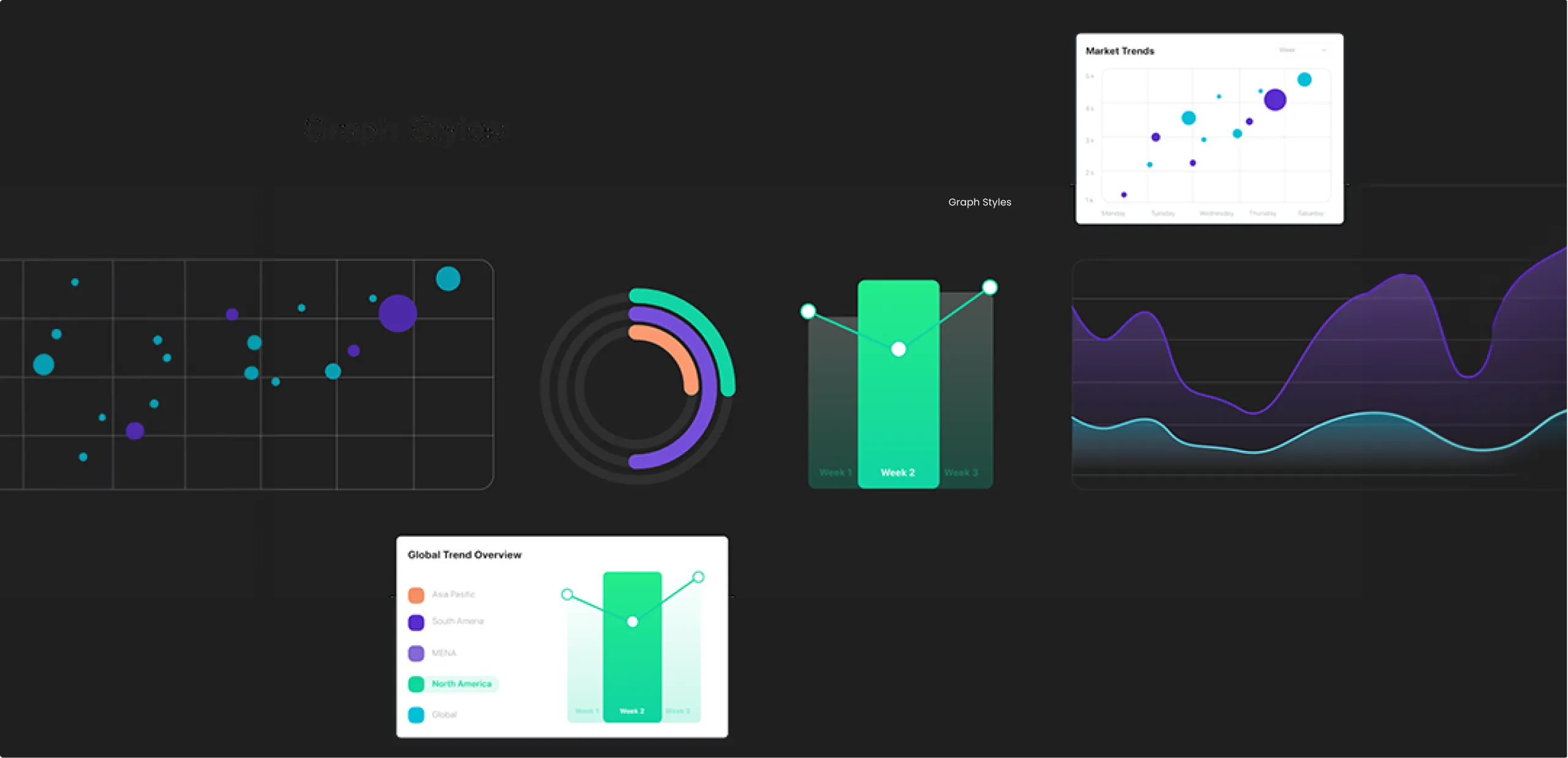
Uniqueness in Measuring and Parameters
The key would be to make sure if there was a bar graph or a pie chart, they were represented in the right way and showcased relevant data that made sense. Read below on why there were chosen.
This type of visualization was used to represent a relationship between a few data points and markets, the bar chart is simple to understand and is best to represent simple relations between data.
The stacked bar ads a second layer of complexity to the original bar chart. This is used when you want to represent multiple characteristics under one market and compare this with the characteristics of another.
A stacked bar graph gives a quick overview of the differences between the two market segments as well as breaking down the composition of each market response.
A scatter point graph provides a birds-eye view of the market trends between multiple markets, this type of visualization is a great way to understand future trends as it is capable to display data at a much larger scale, the drawback of this type of graph is that you cannot go into some of the details that make this relation. When combined with a dual-axis chart this type of graph becomes extremely powerful showing global trends and the relation between two markets.
Radial charts are best used to display data points that add up to 100 or a fixed number that will be used between two markets. This shows the percentage breakdown of each data point. This type of data visualization can be stacked with concentric circles to show the relation between 2–3 more markets.
Each data visualization type and chart had to be mapped out so that this could be then translated as a working model in Power Bi. The team collaboratively working with the client’s data processing department as well as the power bi developer to better understand the complexities, calculations, and various data types that would be to arrive at the final data points.
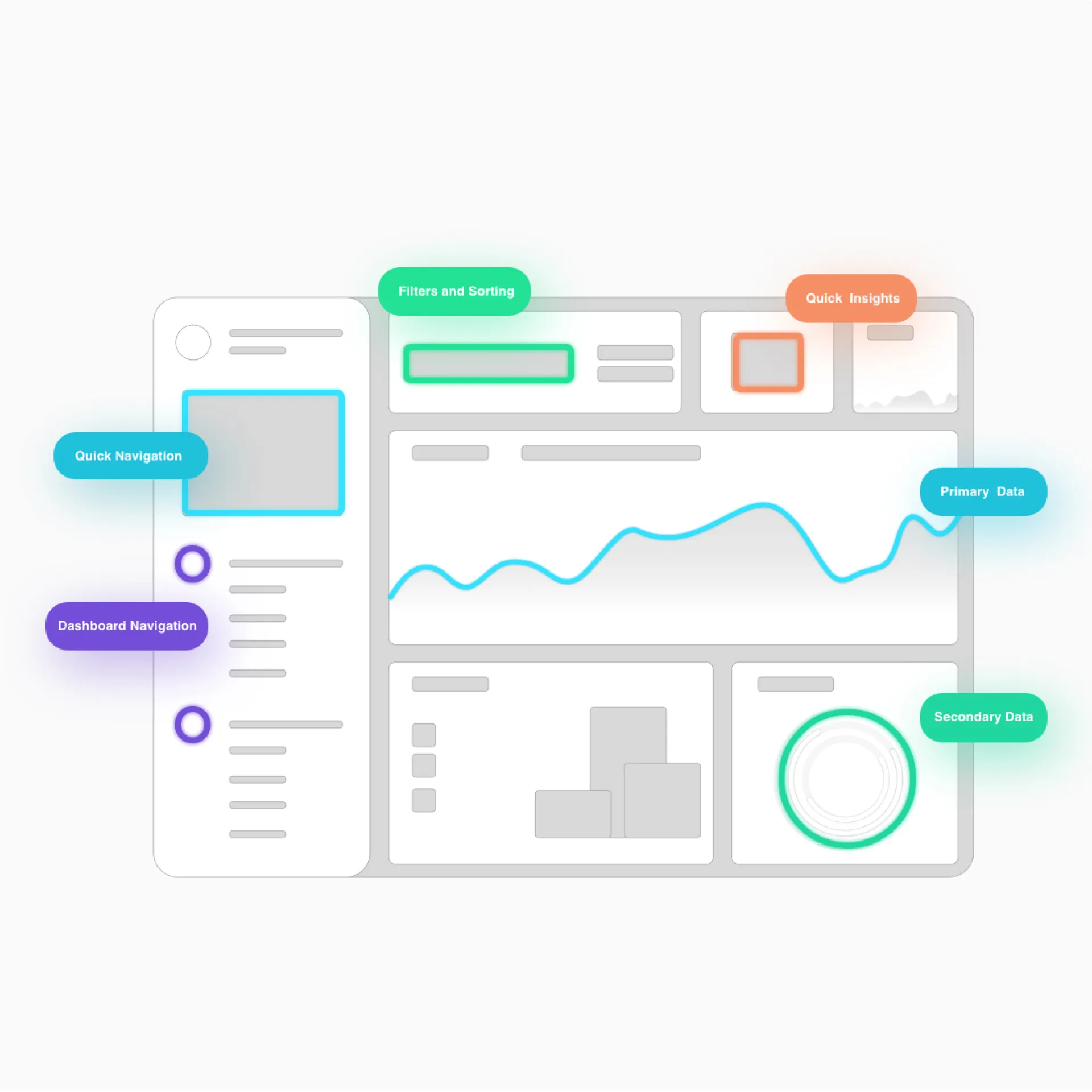
Where Ease Meets Innovation
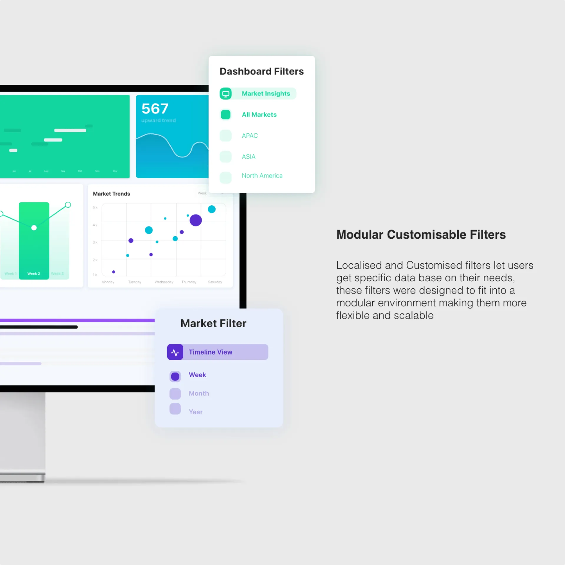
Visually positioned controls and a simplified digital display streamline data visualisation, while clear dropdowns withstand the rigors of adding too much detail on a page.
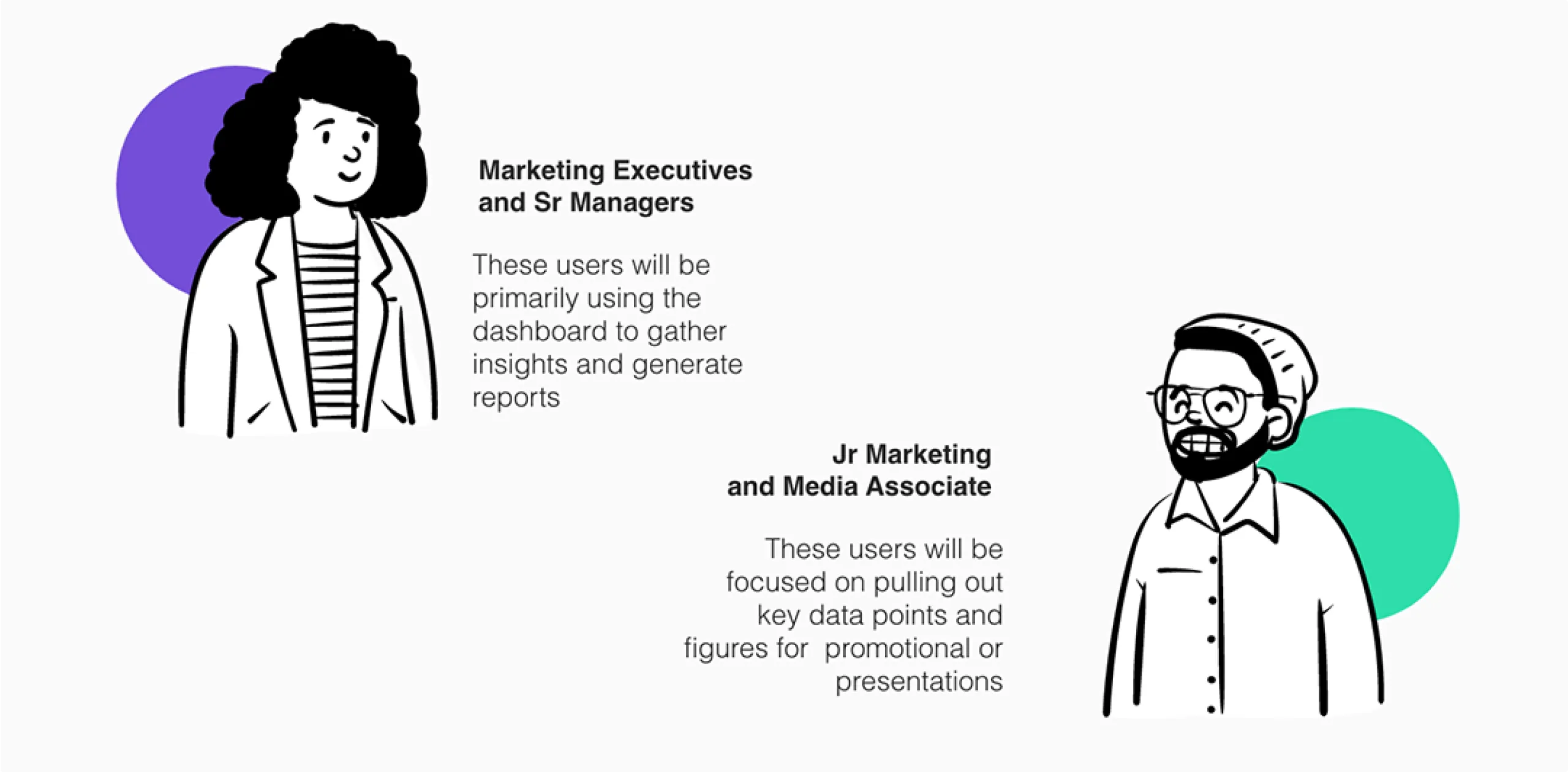
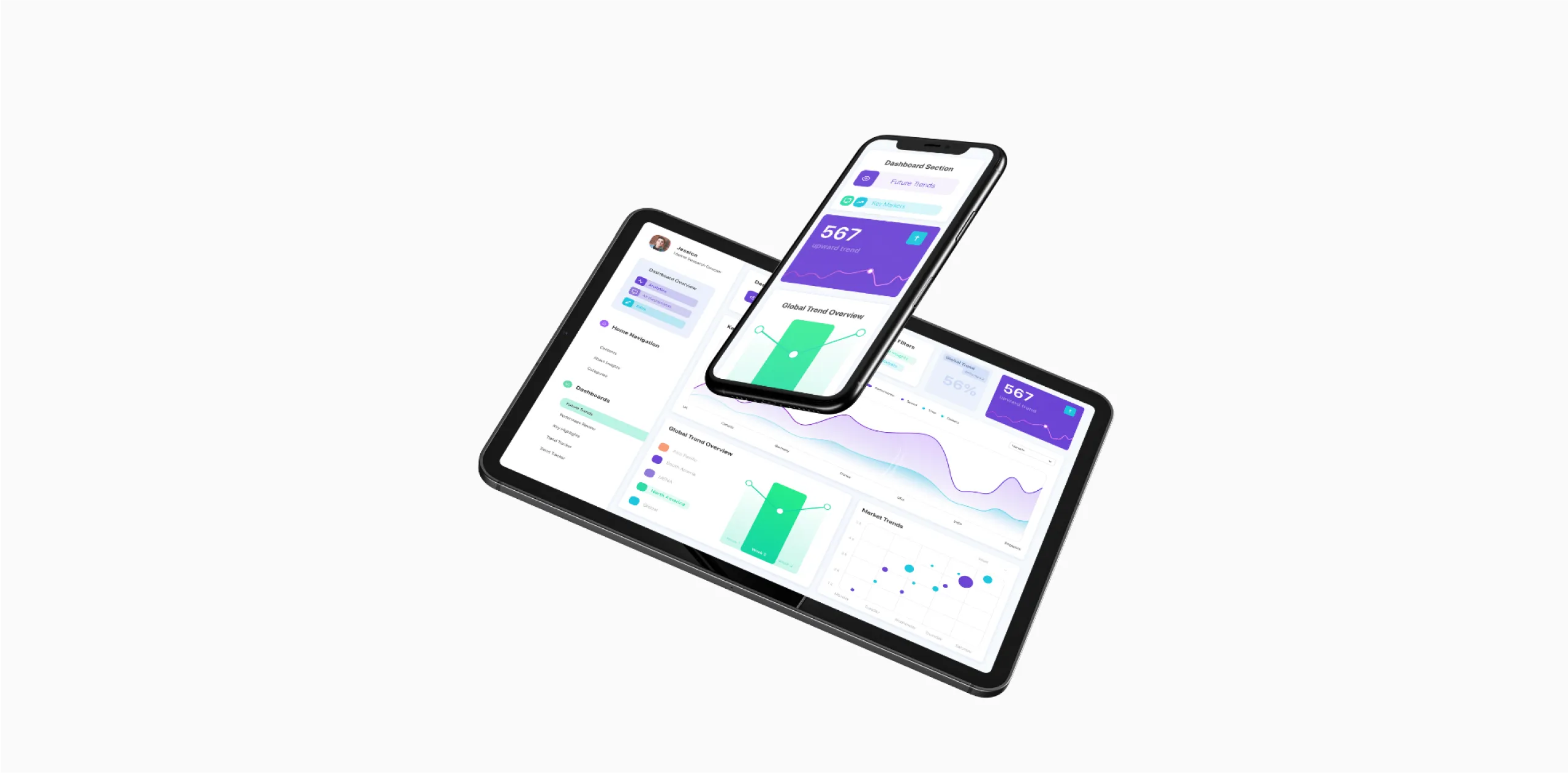
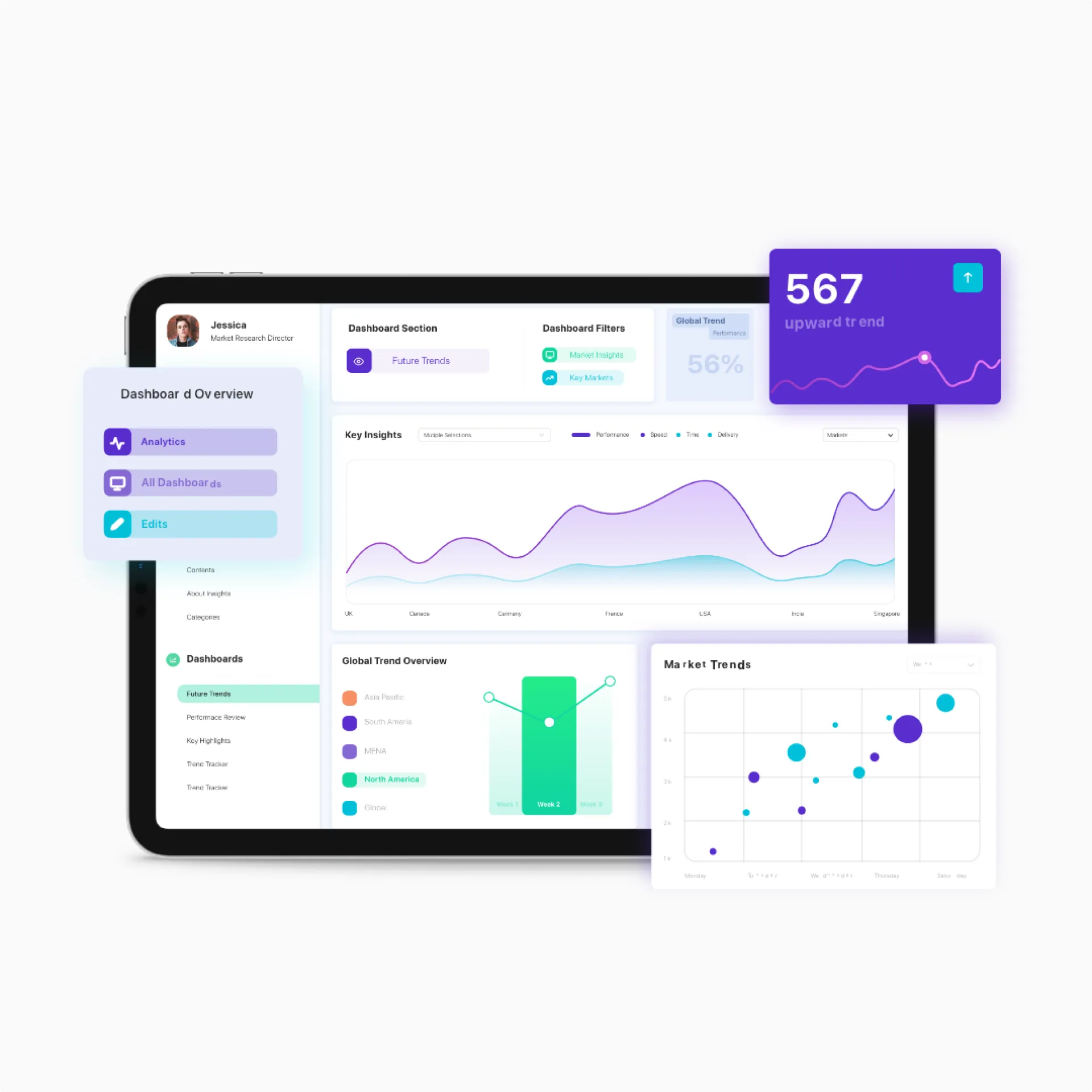
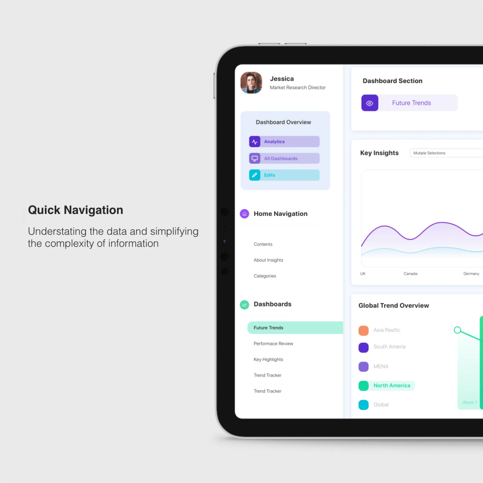
One of the bigger challenges faced was to create an easily navigable user journey. The original product was on PowerPoint and excel sheets. Although this was hard to navigate, the customers were used to this form of navigation, this was a key point of consideration when designing the dashboard. We structured it into 4 key blocks of which 3 were identical representations of the elements on their previous product.
The Navigation block on the left would act as the central hub where users could navigate through the different markets and each dashboard would contain the market data with a top to bottom filter hierarchy. Colour and Opacity played an important role to quickly find the relations between markets and this could be easily stacked on top of each other add complexity while still keeping the overall dashboard clean and easy to understand. Additionally, each graph when clicked would show an isolated relation to making it easier to use and avoiding the use of multiple filters and rules to arrive at a certain insight point.
The Navigation block on the left would act as the central hub where users could navigate through the different markets and each dashboard would contain the market data with a top to bottom filter hierarchy. Colour and Opacity played an important role to quickly find the relations between markets and this could be easily stacked on top of each other add complexity while still keeping the overall dashboard clean and easy to understand. Additionally, each graph when clicked would show an isolated relation to making it easier to use and avoiding the use of multiple filters and rules to arrive at a certain insight point.
User Experience for Today’s data needs
Drafting a user experience for a large amount of data sets was vital. This meant that each section had to be designed for easy readability, have relevant graphs and visual cues along with dropdowns and other supporting elements.
Being a design firm our primary focus is on the user experience and the customer experience, this project required us to break the traditional way to working and pushed us out of our comfort zones, many times the team would find themselves into development territory, whether it be looking to how to work a certain formula, looking into code and experimenting on different ways and workarounds in power-bi. Along the way, we learned the basics of the platform and enough to communicate effectively on what we wanted from a design point of view, although we weren’t experts in power-bi, the team’s ability to quickly iterate on possible solutions and workarounds proved helpful to move things at a faster pace. For the first time, it was the design department’s duty to keep track of the backlog of development changes and making sure that the product runs all features before the launch date.
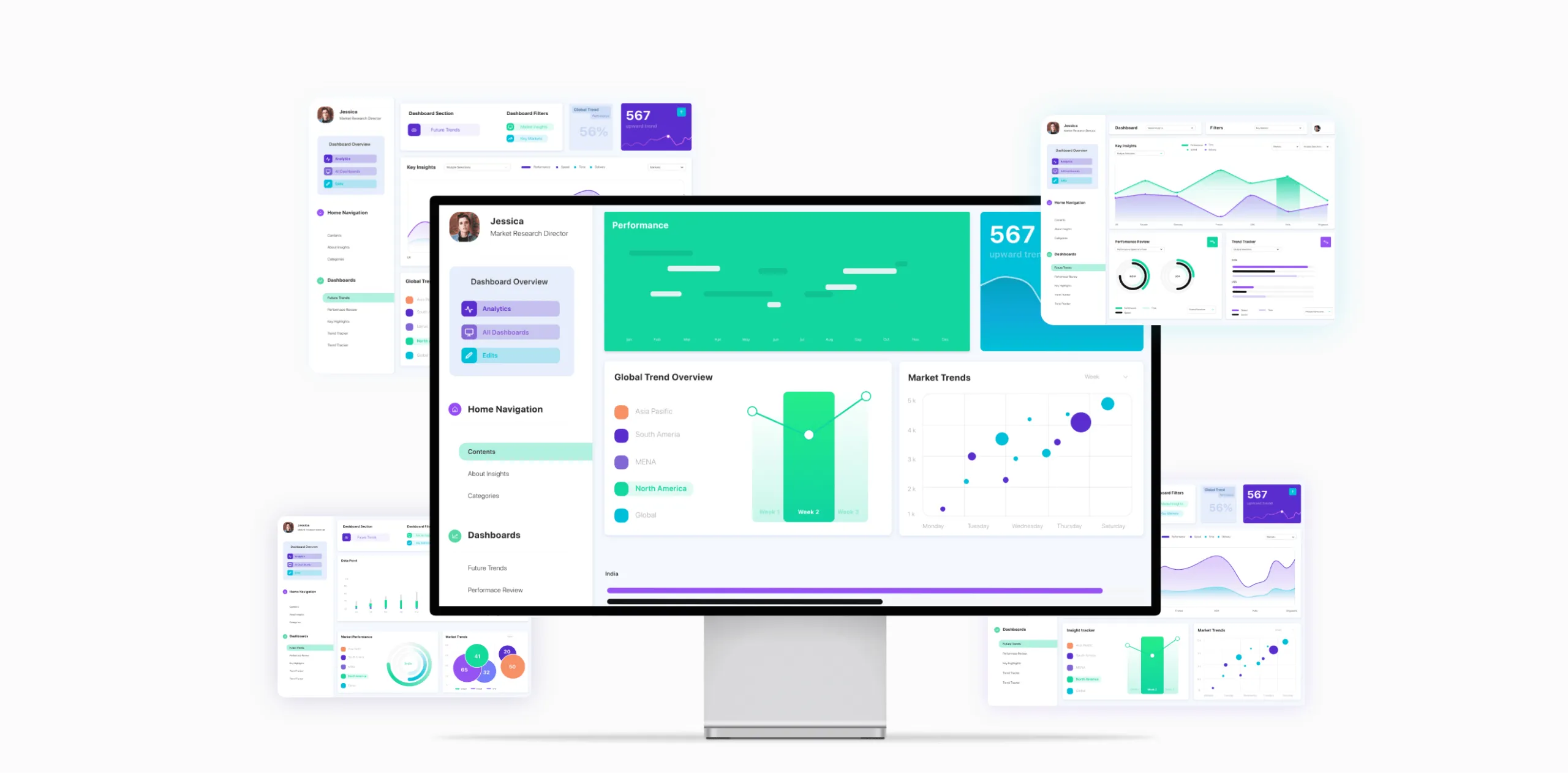
The Redesign from PowerPoint to a custom domain created a new benchmark for Data visualisation
When working on a data-driven project is it’s essential to have all the data cleaned up and reviewed multiple times before you create your data models and visual language. Inputting data takes a long time and changing the data type mid-way not only will delay timelines, but drastically impact the quality of the design as well. The result was a platform that provided a lot of value to the client and as well as its consumers on a global scale, not only coz the UI was clear, concise, had soothing colors in a cool tone for longer periods of time but also had a very clear user journey and information architecture that lead the users from point A to B in a simple and logical manner.
Services
- Interaction Design
- Data Visualisation
- Prototyping
- UI/UX Design
- Product Development
Year
2019-20
Market
APAC/Global